Acrylic Phone Grip File Setup: Circular Canvas Rules
Acrylic Phone Grip File Setup: Circular Canvas Rules
How the 70mm disc, 2.5mm clear border, and RGB requirement shape every artwork decision.
TL;DR
A custom acrylic phone grip is a working everyday accessory, not a display piece — your art rides on the back of a held phone and gets read from a slight angle and at arm's length. The single most consequential decision is keeping your subject centred and legible inside a 70mm circle, with key elements pulled clear of the 2.5mm transparent acrylic border. Open the product in Popecho's onsite editor to see the circular cut guide, confirm your background handling, and export in RGB before you submit.
What This Subtype Actually Demands
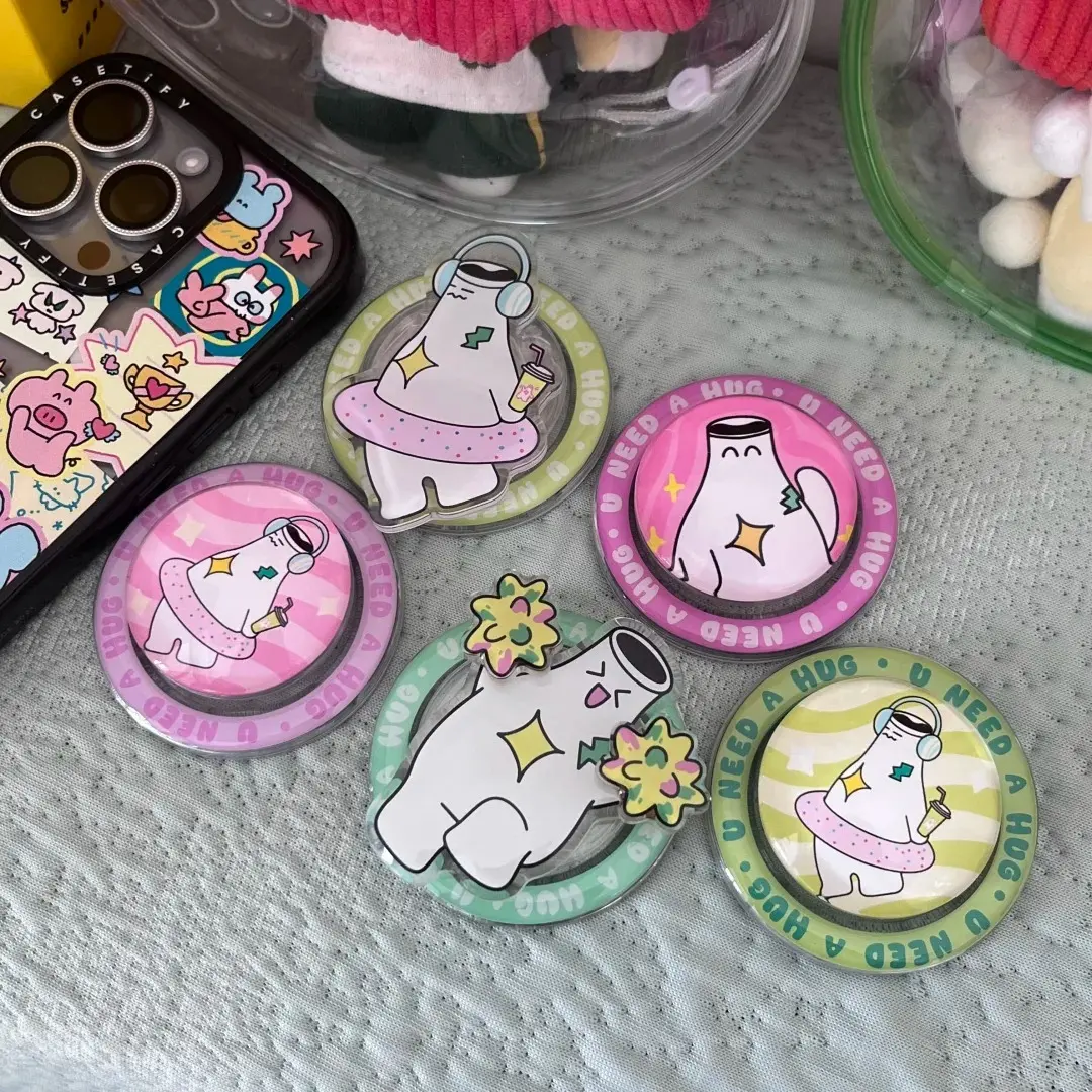
The acrylic phone grip is fundamentally different from a standee or charm that sits on a shelf. It clamps to the back of a phone via a 3M adhesive mount and expands into a collapsible airbag grip — the same expand-and-collapse action as a PopSocket. That means your art is in motion, seen at angles, and competing with everything else in the environment. A design that looks polished at full screen on your monitor can disappear at 70mm diameter on a dark phone case.
The circular format enforces one hard constraint: there is no dominant axis. No left-to-right story, no portrait breathing room. Everything has to resolve inside a 70mm circle, and the 2.5mm transparent acrylic border is structural — it does not get trimmed away. It is always visible as a clear ring around your print. Art that drifts toward the edge will sit behind that ring rather than at it.
Setting Up the Artwork
Work at 70×70mm / 827×827px at 300 DPI. When you open this product in Popecho's onsite editor, the circular cut guide snaps into place automatically — you can see exactly where the printable area ends and where the clear acrylic border begins without measuring anything manually.
Background handling is the first real decision point. A transparent PNG tells Popecho's production process to treat the disc as a die-cut piece, so only your painted or drawn areas carry colour. A white-background PNG or JPG prints with a solid white base beneath the art — useful when you want opaque colours that read cleanly against any phone case colour. Popecho's editor includes a smart background-removal tool; run it and confirm the result before finalising, because a missed fringe around a character outline will show as a faint halo on the finished piece.
Keep your main subject centred and scaled to fill roughly 80–90% of the inner circle. Q-version (chibi/simplified) character art is the format best suited to this canvas — a single expressive figure with clear silhouette reads well at 70mm and from a slight angle. Wide landscape compositions and text-heavy layouts do not translate to this shape.
File size cap is 2MB per upload; PNG or JPG only.
Surface and Production Decisions
The acrylic disc uses sandwich lamination: your print is sealed between acrylic layers, which protects the image but also means the finished colour is seen through the clear top layer. That layer adds a slight depth effect, which is generally flattering — but it also amplifies any print quality problem. A blurry or low-resolution upload that looks passable on screen will show visible degradation through the clear face.
Colour mode is non-negotiable: submit in RGB. CMYK files are shifted to RGB during production, and the conversion causes oversaturation and hue drift that is not correctable after the fact. Work in RGB from the first canvas, not as a final export step. If the cart preview shows unexpected colour change after submission, the file needs to be re-exported from source in RGB.
Neon or very light colours (value below roughly 20%) also reproduce poorly through the acrylic layer — they tend to flatten or blow out. If your palette relies on near-white highlights or ultralight tints, do a test order at MOQ 1 before committing to a larger run.
Laser cutting handles the edge. It follows the 70mm longest-edge rule and produces smooth, burr-free edges. The 3M adhesive base is single-use — repositioning after the first application weakens the bond and is not recommended.
Popecho produces in 8 days at an MOQ of 1 unit, so a single test piece is a practical quality gate before any volume order.
What Trips Creators Up
CMYK export from illustration software. Many creators export from Procreate or Photoshop without checking colour mode. The resulting file looks fine on-device but arrives oversaturated in production. Set the document to RGB before you start painting, not at export.
Art scaled too large or too small for the circle. A full-bleed illustration that fills the canvas looks great on a square artboard and gets visually compressed once cropped to a circle. Centre your subject with deliberate margin and preview the circular crop before submitting.
Ignoring the transparent border. The 2.5mm clear acrylic ring is always there. Detail or text placed close to the cut line ends up behind it, effectively in a no-contrast zone. Treat the border as dead space during layout.
Screen-to-print colour variance. Monitor brightness and colour calibration vary widely. Popecho notes that screen-to-print colour differences are outside the post-sales guarantee scope — calibrate expectations and rely on a physical sample order to confirm palette before a production run.