Acrylic Color Board File Setup: Border and Base Decisions
Acrylic Color Board File Setup: Border and Base Decisions
How the dual-selection system shapes your artwork before you export a single pixel.
TL;DR
The clear acrylic color board is a flat rectangular acrylic panel — no stand, no die-cut silhouette — where your artwork sits between a printed base board and a fixed decorative border frame. The decision that matters most is whether your base board is transparent or opaque, because that choice determines whether white and light-colored areas in your art read as solid or disappear into the acrylic. Open the product in Popecho's onsite editor, confirm the white-ink layer, and lock in your border and base board combination before finalizing your file.
What This Subtype Actually Demands
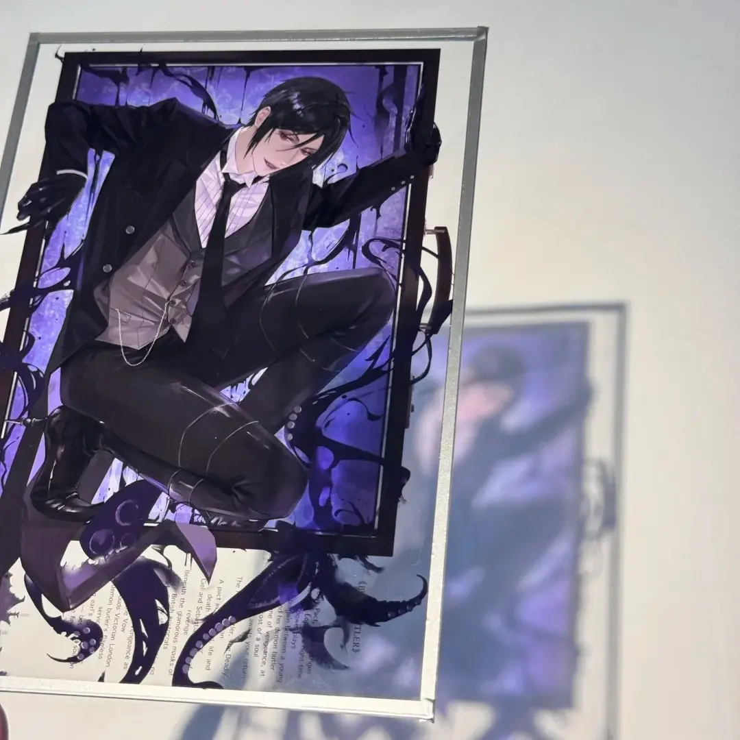
The clear acrylic color board occupies an unusual position in the merch landscape: it has no base stand, no pin hardware, and no die-cut outline to chase. What it does have is a two-part material system — a decorative border frame on the outside and a base board underneath your artwork — and both selections are fixed at the SKU level. You choose your border finish (glitter, rainbow holographic, laser prismatic, sand-flow silver, or clear) and your base board finish (transparent, matte laser gold, bright silver, sand-flow black, and others) at order time. Those two choices interact with your artwork in ways that aren't obvious from a flat mockup: the border physically overlaps the outer edge of the print area, and the base board determines how much light passes through any unprinted region. Composition decisions and white-ink decisions both need to happen before you finalize the file, not after.
Setting Up the Artwork
Set your canvas to the finished cut size for your chosen variant: 60×90 mm, 100×100 mm, 100×150 mm, 140×140 mm, or 140×210 mm. Popecho's onsite editor loads the correct canvas dimensions, bleed boundary, and safe-zone overlay for each size automatically — open the product there before you start placing art, not after. The safe-zone overlay is the critical reference: the border panel overlaps the outer edge of the print area, so any text or key character detail placed too close to that boundary will be obscured by the frame on the finished piece.
Export at 300 DPI in CMYK. The editor confirms the color mode for each variant, so check before exporting. Accepted formats are PNG, JPG, and PSD.
The white-ink layer in Popecho's editor is directly relevant here. If your base board is transparent (透明板), any area of your artwork that is white or near-white will print semi-transparently over the clear acrylic — the white-ink layer is what gives those areas full opacity. Enable it in the editor for any design element that needs to read as solid against a clear or reflective base. If you are using an opaque base board such as bright silver or matte laser gold, white-ink decisions are less critical because the base itself provides a solid backing.
Surface and Production Decisions
The base board finish is the single biggest variable in how your final piece reads. A transparent base lets the desk surface, display shelf, or light source behind the board show through every unprinted area — this creates a floating, luminous effect with the right composition, but it swallows light-colored detail if you haven't applied the white-ink layer to the right elements. Opaque-finish bases reflect light back through the print and make colors appear more saturated and consistent, similar to printing on metallic paper.
The border finish is a display decision as much as a production one. Reflective borders — rainbow holographic, laser prismatic, glitter panel — are visually aggressive at artist alley tables and in unboxing photography. They work best when the artwork composition leaves visual breathing room near the edge rather than running full-bleed content into the frame zone. The border width is fixed by the panel spec and cannot be adjusted per design, so account for it as a design element during composition rather than cropping around it afterward.
Popecho's production lead time for this product is 12 days. MOQ is 1 unit, which makes single-design proofing practical before committing to a larger run. Batch pricing tiers open at 500+ units.
What Trips Creators Up
White areas vanish on the clear base board. Light and white elements printed on a transparent acrylic base become nearly invisible without a white-ink backing layer. Enable the white-ink layer in Popecho's editor for every element that needs to read as solid.
Art runs into the border zone. The decorative border frame overlaps the outer edge of the print area. Placing character faces, readable text, or fine linework too close to the edge means the frame covers them on the finished piece. Respect the safe-zone overlay in the editor.
Choosing a border-and-base combination without previewing the interaction. A glitter border over a sand-flow black base reads very differently than the same border over a transparent base. Check the spec matrix in Popecho's editor before committing to a variant combination, since not every pairing may behave as expected from a flat reference image.
Submitting an RGB file assuming CMYK conversion will be neutral. Colors on transparent and metallic acrylic substrates shift more than on paper. Convert to CMYK in your file and verify against the editor template before export to avoid hue surprises in the final piece.