Wooden Standee File Setup: Designing for a Warm Wood Base
Wooden Standee File Setup: Designing for a Warm Wood Base
Why the natural wood tone changes every colour decision your artwork makes.
TL;DR
A custom wooden standee is a 4 mm natural wood board die-cut to your character's silhouette and UV-printed on the front face — no separate stand hardware, no white substrate. The single most consequential decision is designing around the warm beige wood tone rather than assuming a neutral base. Open your chosen height variant in Popecho's onsite editor, lock in your safe-zone boundary, then calibrate artwork colours before committing to a full run.
What This Subtype Actually Demands
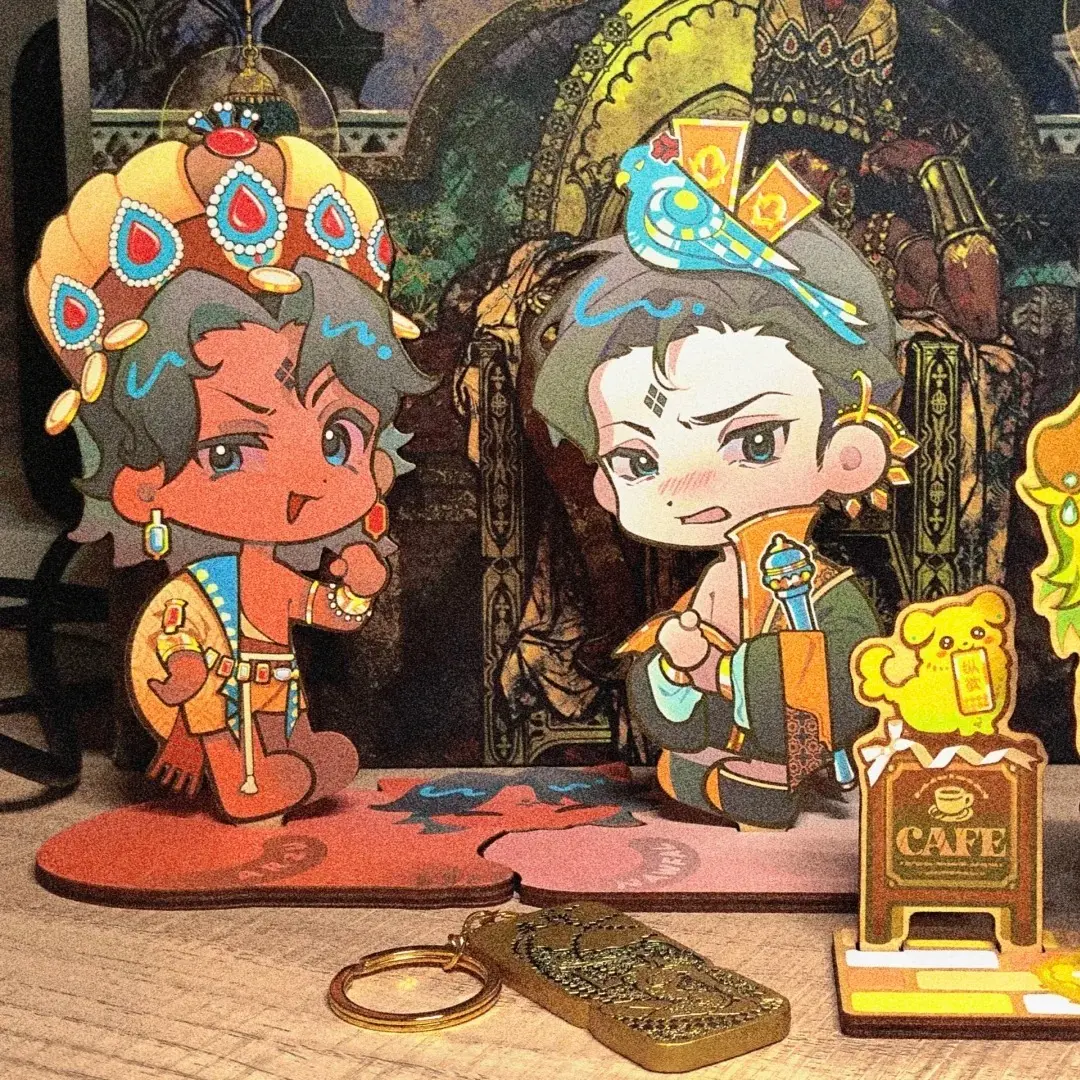
A wooden standee is not a shrunken acrylic figure. The substrate is opaque, warm-toned, and visibly grained — that grain shows through lighter ink areas no matter how clean your file is. Popecho UV-prints directly onto the 4 mm wood face, which means every pale fill, every near-white highlight, and every cool-toned sky reads warmer in hand than it does on your monitor. That is not a defect; it is the material's character. Leaning into it — earthy palettes, warm linework, illustrated textures — produces standees that feel deliberate rather than compromised. Fighting it with white fills or cool pastels is where colour drift becomes a problem. The second demand is structural: the die-cut silhouette and the slot base are cut from the same board, so any artwork detail that runs too close to the outer edge is also close to the saw path.
Setting Up the Artwork
Open the product in Popecho's onsite editor and select your height — 5 cm or 7 cm. The editor loads the die-cut silhouette guide and the inner safe-zone boundary for the variant you pick, so you can see exactly how much of your artwork is protected and how much sits inside the cut risk area before you finalize anything.
Submit artwork as a PNG with a transparent alpha channel. The die-cut follows your character outline, and any background pixels outside the silhouette are discarded at cut — a clean alpha removes ambiguity about where that edge sits. JPG is accepted, but compression artefacts along transparent-edge areas can leave a faint halo on the finished silhouette; PNG is the safer choice.
Set colour mode to RGB and resolution to 300 DPI. Popecho's UV print workflow runs natively in RGB, so no CMYK conversion is needed. Inside the editor, the safe-zone overlay flags the inner boundary of the character contour — keep eyes, text, and any fine line detail clearly inside that boundary. At 5 cm height especially, thin protrusions like single-strand hair or narrow antennae approach the minimum cut width for 4 mm wood and may not survive the die-cut cleanly; simplify those shapes or move them inward.
Surface and Production Decisions
UV printing on wood delivers strong colour saturation on mid-to-dark values, but the warm beige substrate acts as a tint layer beneath every ink colour. Cool blues and lavenders shift noticeably warmer; whites and light greys become cream. Calibrate your screen proofs with this in mind — view the design against a warm off-white background rather than a pure white artboard, and assess whether your character reads clearly at that shifted tone.
There is no white-ink layer in this production process, so you cannot print a white base coat to neutralise the wood. If your character design depends on pure white areas — white clothing, bright highlights, stark backgrounds — those regions will read as natural wood grain. The workaround is to redesign those areas as warm tones, or to treat them as intentional wood-show zones that add texture.
The laser die-cut handles the outer silhouette and the slot channel in the base tab simultaneously. The slot-fit base ships flat and slots together without glue — a tactile detail that photographs well and plays well at artist alley tables. Note in your product packaging that the standee arrives in two flat pieces; buyers unfamiliar with the format occasionally assume it arrives pre-assembled. Popecho's production lead time for wooden standees is approximately 8 days, and the MOQ is 4 pcs per design — low enough to proof a single character before scaling.
What Trips Creators Up
Treating the wood base as white. White fills do not print white on natural wood — they print as the wood tone. Audit artwork before submitting and replace any white-dependent area with a warm neutral or a deliberate no-ink zone.
Fine silhouette details at 5 cm. Thin protruding shapes that look safe at 7 cm become fragile or uncut at 5 cm. Use the safe-zone overlay inside Popecho's editor to check narrow features before finalising the smaller height variant.
JPG edge artefacts creating a halo. Compression noise along formerly transparent edges prints as a faint fringe on the finished cut. Switch to PNG with a clean alpha channel; it removes the guesswork entirely.
Skipping the small-run proof. The warm wood tone shifts cool-palette artwork more than most creators expect from a screen preview alone. Running 4 pcs — the MOQ — before committing to a larger quantity is the practical way to confirm colour results before your full production run.