Acrylic Card Binder File Setup: Cover Print Logic
Acrylic Card Binder File Setup: Cover Print Logic
How the reverse-face print, background transparency, and spine zone shape every cover decision.
TL;DR
A custom acrylic card binder from Popecho prints your artwork on the inner face of a 3mm clear acrylic cover and reads it through the material from the front. That single fact drives nearly every file decision: upload in correct orientation (Popecho flips it at production), choose your background type intentionally, and keep key art out of the 28mm spine zone. Open the product in Popecho's onsite editor — the front and back canvas views are already set up at 200×235mm so you can start placing art immediately.
What This Subtype Actually Demands
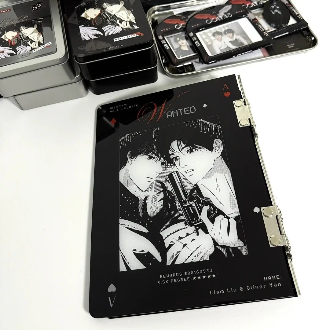
An acrylic card binder is not a paper-backed merch form with a clear laminate on top. The artwork is printed directly onto the reverse face of a 3mm high-transparency acrylic panel, then read through the material from the front. That distinction changes how colours land, how backgrounds behave, and where you can safely place detail.
The cover is the only customisable surface — the 20 inner PP pages ship as a bundled mix of 3-inch and 6-inch pocket layouts and are not individually printable. If your project scope includes custom inner pages, that is a separate product decision to make before briefing artwork. Everything below applies to the cover alone, which is what determines whether the finished binder looks like your IP or a generic album with your file attached.
Setting Up the Artwork
Popecho's onsite editor loads this product in a double-view canvas — a front surface and a back surface, both set to 200×235mm — so you are working at the exact finished dimensions from the first click. There is no dashed bleed line to extend into and no external template to fetch; the canvas boundary is the cut boundary.
Background handling is the first real decision. Inside the editor, the blue canvas area is treated as transparent at production. A PNG with a transparent background will show the raw acrylic through any open areas — a clean, near-glass look that paper merch cannot replicate. A white-background PNG renders with a visible white fill. A JPG carries its own background colour into production. None of these outcomes is wrong, but they are meaningfully different, so choose deliberately rather than defaulting to whatever your export settings happen to produce.
Keep critical design elements away from the left edge. The 6-ring punch zone runs along the spine side, and the dimension chart indicates a 28mm hinge area where artwork will be interrupted or hidden by the ring hardware. Art that bleeds into that strip in the file preview will not be visible on the assembled binder. (File at 300 DPI, RGB, PNG or JPG, max 10 MB.)
Surface and Production Decisions
Printing on the reverse face of acrylic and reading through the material introduces two practical limits that differ from standard UV-on-surface printing.
First, very light tones and fine lines lose definition. Colour values below roughly 20% and hairline strokes that read clearly on screen will fade or disappear against the acrylic substrate. Bold shapes and mid-to-full-value colour ranges reproduce most faithfully. If your design uses delicate linework or near-white highlights as key detail, thicken and darken them before upload.
Second, fluorescent and out-of-gamut colours cannot be faithfully reproduced through the material. Popecho's production pipeline handles the mirror flip automatically — you upload in normal orientation — but it cannot expand the colour gamut of the acrylic substrate itself. Finished results for fluorescent values will show a visible colour difference from the screen preview, and this falls outside after-sale coverage.
The 3mm acrylic cover is also subject to minor surface micro-scratches inherent to the material. This is not a production defect; it is a material reality. Creators with very high surface-finish expectations should factor this in before committing to a run, particularly for close-up product photography.
What Trips Creators Up
Uploading a CMYK file. CMYK converts to oversaturated RGB at production and the colour shift can be significant. Always export in RGB colour mode before uploading — if the cart preview shows unexpected saturation, replace the file.
Pre-flipping the artwork. Because the print goes on the inner face, some creators manually mirror their file thinking they need to compensate. Popecho's pipeline applies the flip automatically. Upload in correct, non-mirrored orientation every time.
Ignoring the spine zone. The 28mm strip along the left edge (where the 6-ring punch runs) is a hard exclusion zone for meaningful art. Character faces, key text, and logo lockups placed there will be hidden or punched through in the assembled binder.
Using transparent PNG without intending to. A transparent background on the cover is a deliberate design choice — not a neutral default. Creators who expect a coloured or white background behind their art and export with transparency will receive a binder where those areas show raw acrylic. Check your export settings before the final upload.