Long-Strip Acrylic Charm File Setup: The 1:4.5 Ratio Problem
Long-Strip Acrylic Charm File Setup: The 1:4.5 Ratio Problem
How the 20×90mm format changes every layout, background, and safe-zone decision you make.
TL;DR
The long-strip acrylic keychain charm is a thick CNC-cut piece in a 20×90mm format — a 1:4.5 aspect ratio that demands a fundamentally different layout approach than any square or standard acrylic charm. The biggest decision is background treatment: semi-transparent lets the acrylic show through for a stained-glass glow, while opaque gives you a fully solid front-and-back print. Set your canvas to 23×93mm, keep all critical content 3mm inside the cut line, stay in RGB, and open the product in Popecho's editor before touching a pixel.
What This Subtype Actually Demands
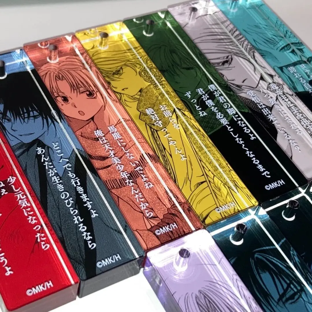
A 20×90mm charm is not a badge made skinny — it is a different compositional problem entirely. The 1:4.5 aspect ratio is purpose-built for quote strips, lyric bars, and character close-up crops, and the layout has to commit to that logic from the first canvas stroke. Art that works fine on a 60×60mm charm will be awkward, cramped, or completely illegible when compressed into a 20mm-wide strip.
Adding to the complexity, this subtype ships in two genuinely different background modes. The semi-transparent variant is not a translucent film — it is a substrate-level effect where the printed layer allows the thick acrylic body to remain partially visible, producing a backlit glow that changes with the light source. The opaque variant blocks the substrate entirely and prints both sides as independent solid surfaces. These are not cosmetic choices; they change how you structure every layer of your file.
Setting Up the Artwork
Your working canvas is 23×93mm — the 20×90mm finished cut plus 1.5mm bleed on all four sides. When you open this product in Popecho's editor, the bleed boundary and safe-zone overlay load automatically; you do not need to measure and draw these manually. The editor also provides a template catalog with two starting points for this variant, so you can skip building the long-strip canvas from zero and work directly from a proportionally correct base.
Because the editor surfaces a double view, front and back are handled as two separate panels inside a single session. Use that split intentionally: the front panel carries your primary character crop or quote layout; the back panel is where you can add secondary information, a logo mark, or a complementary color field — or leave it as a clean solid if you want the opaque variant to have a finished reverse without visual clutter.
For the semi-transparent variant, upload one front artwork layer plus one background image. The background prints semi-transparent, so design it as something that reads well when the acrylic tint bleeds through — flat color fields and simple gradients hold up better than fine-detail background illustrations.
For the opaque variant, upload front and back as two fully independent files. Keep critical content — especially any text — at least 3mm inside the cut line on both panels. At 20mm wide, that safe margin is narrow, and anything outside it is at real risk at the cut line.
Surface and Production Decisions
CNC cutting gives the finished piece clean rounded corners and a precise edge, but acrylic will carry minor surface micro-scratches as a result of the cutting and handling process. Popecho's production notes acknowledge this explicitly — it is a material reality of thick acrylic production, not a defect, and it falls outside after-sales coverage. If your project audience expects jewelry-grade clarity on every surface, set that expectation before ordering samples.
The semi-transparent background creates a stained-glass effect that is specific to the thick acrylic substrate. The acrylic body itself is clear; the printed background layer modulates how much of that clarity shows through. Colors that look muted on screen can read as luminous against backlight, and colors that look vivid on screen can disappear into the substrate in ambient light. Run at least one single-unit sample under both lighting conditions before committing to a print run — Popecho's MOQ of 1 unit makes this cost-free.
Color mode matters more here than on paper goods. UV printing on acrylic reads RGB values differently than CMYK, and submitting a CMYK file will produce a visible color shift in the final piece. Lock your file to RGB before export, every time.
What Trips Creators Up
Designing at the wrong aspect ratio first. Most creators start in a square or A-ratio canvas and try to adapt the layout after. The 1:4.5 strip format needs to be the starting canvas — open Popecho's editor with the correct long-strip template and build there from the first element.
Treating semi-transparent like a simple filter. The background translucency is not a Photoshop opacity slider applied to your full artwork — it is a separate uploaded background layer that prints differently from the front. Design the background layer as its own asset, not a duplicate of the main art.
Putting text too close to the 20mm edge. At 20mm wide with a 3mm safe zone on each side, you have roughly 14mm of reliable print width. Any body text or small character detail outside that inner region risks being trimmed or printing unclear at the cut line.
Submitting CMYK files. The color shift is significant and visible in the finished piece. RGB is the only accepted color mode for this product — check the color profile in your file properties before every export.