
Custom Newspaper Print: Stock, Layout, and Color Setup
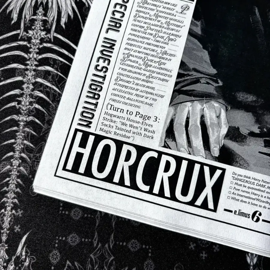
Custom Newspaper Print: Stock, Layout, and Color Setup
How kraft base tone, CMYK conversion, and front/back layout split change your final sheet.
TL;DR
Custom newspaper print from Popecho is a flat single-sheet CMYK product in A4 or A3, on either bright-white 100G woodfree or warm-tan 150G kraft stock. The decision that shapes everything else is stock choice: kraft shifts every printed color toward amber and renders white areas as tan, so your layout logic must account for that before you upload. Open the product in Popecho's onsite editor, choose your template or full-custom path, set front and back, and proof in CMYK before finalizing.
What This Subtype Actually Demands
A custom newspaper print is a flat, single-sheet piece — not a booklet, not a folded zine. The A3 variant delivers one broadsheet-scale sheet (420×297 mm) that ships flat and folds only if you choose to fold it yourself. That single-surface-per-side reality means every layout and color decision you make shows up with nowhere to hide.
The product forces two sequential choices before you touch a canvas: size (A4 or A3) and stock (woodfree or kraft). These aren't aesthetic tweaks — they change the color foundation of every image on the sheet. The 100G woodfree base is bright white and smooth, maximizing color contrast and fine-line sharpness. The 150G kraft base is warm tan and textured, and it behaves like a permanent color filter over your entire design. Choose stock first, then design to it.
Setting Up the Artwork
Canvas dimensions include a 3 mm bleed on all four sides: A4 builds at 216×303 mm, A3 at 426×303 mm. Finished cut is 210×297 mm and 420×297 mm respectively. Resolution is 300 DPI at final print size, and CMYK is the working color mode — RGB files are accepted but converted at production, and that conversion is where saturated colors quietly lose punch.
Popecho's onsite editor handles both layout paths for this product. The editor supports a double-view workspace — front and back surfaces load as separate canvases so you can plan both sides without switching files or guessing at alignment. For the template path, Popecho's editor loads a pre-built newspaper column-grid overlay automatically; your job is to fill the designated zones with photos, headlines, and body text rather than building the grid from scratch. For the no-template path, the blank canvas at full bleed size is ready to receive your own layout. Eight template starting points are available in the catalog across the product's configurations — browsing those before committing to a full-custom build can save significant layout time.
The editor also shows a live red safe-zone band 3 mm inside the trim line on all four sides. Keep all critical text and key visuals inside that band. Anything crossing into the bleed zone is at genuine risk of being cut.
Surface and Production Decisions
Four-color CMYK high-definition printing is the only print method here — no spot colors, no metallic layer, no white ink. That constraint is what keeps MOQ at 10 pcs and unit cost low, but it also means you must make every color decision within CMYK's gamut.
On woodfree stock, CMYK delivers its sharpest result: high contrast, clean fine lines, photo-accurate mid-tones. This stock suits editorial layouts where photo fidelity and text legibility are both priorities.
On kraft stock, the tan substrate acts as a permanent warm overlay. Light and mid-tone areas shift visibly toward amber; areas you designed as white will render as the natural kraft tan, because there is no white ink in this process. The practical rule is to treat the kraft base as your lightest possible tone and design all other values darker from there. The before/after color comparison visible in the product detail images makes this shift concrete — it is not subtle.
For CMYK conversion accuracy: build your palette in CMYK from the start, and run a soft-proof pass before uploading. Electric blues, hot pinks, and neon greens are the most common problem values — they look correct on an RGB monitor and print noticeably flatter.
What Trips Creators Up
Designing with white space on kraft. White backgrounds, white text, and white borders do not print white on kraft — the stock itself is the background. Redesign any white-dependent element as a darker value or reposition it against a printed color block.
Uploading in RGB and assuming conversion is lossless. Popecho's production converts RGB to CMYK at print time. Saturated palette choices made on screen may not survive the conversion intact. Do the color-mode work in your file, not after submission.
Placing text inside the bleed band. The 3 mm bleed zone on all four sides is cut territory. The editor's red safe-zone overlay makes this visible — if text is outside the red band, move it in before you finalize.
Submitting a low-resolution or incorrectly sized file. Blurry source images, incorrect canvas dimensions, and pixel-count mismatches all produce print defects that fall outside Popecho's warranty coverage. Check DPI at final print size — not at a scaled-down preview — before uploading.