Holographic Trading Card: Substrate × Print-Mode Setup
Holographic Trading Card: Substrate × Print-Mode Setup
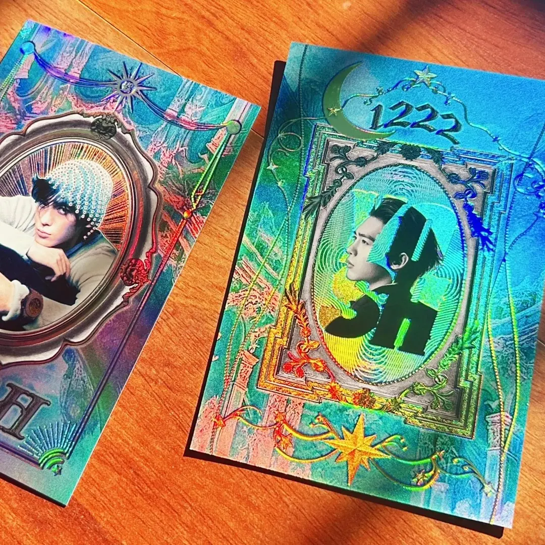
How the dual-flash effect is built from two independent choices your artwork has to support.
TL;DR
Popecho's holographic trading card (63×88mm) produces its signature dual-flash effect through the combination of a holographic substrate and either a white-ink or reverse-varnish print layer — two variables that interact, not one. Popecho's onsite editor auto-generates both the white-ink channel and the reverse layer, so the critical work happens before upload: choosing a substrate texture and a print mode whose visual logic your artwork is actually built to support.
What This Subtype Actually Demands
A holographic trading card is not a flat matte photocard with a shiny finish applied afterward. The dual-flash (双闪) effect is structural: the holographic substrate — shattered-glass laser, water-ripple laser, plain laser, white-porcelain, or light-silver — interacts with the colour-print+white-ink or reverse-varnish layer on top of it to produce a card that looks visually different depending on the angle of light. That two-state shift is the product. The substrate and the print-layer mode are independent variables, and the final card is the result of both choices working together. A creator who picks a substrate without thinking about which print mode it pairs with can end up with a card that looks nearly blank under flat lighting or loses the shimmer entirely behind a heavy white-ink layer — neither is a production defect, both are design decisions made by default.
Setting Up the Artwork
The finished cut for this card is fixed at 63×88mm — there is no alternate size for this product. When you open the card in Popecho's onsite editor and select your variant (substrate + print mode + UV option), the safe-zone overlay for the 63×88mm die line loads automatically. Keep all key art and legibility-critical text inside that boundary.
The editor supports a double-sided (front/back) canvas for every configuration. The front surface carries the primary visual; the back can carry a secondary design, branding, or a plain treatment — both surfaces go through the same substrate and print-mode logic, so plan both sides intentionally rather than leaving the back blank by default.
Here is the part most creators try to handle manually and don't need to: Popecho's editor auto-generates the white-ink channel and the reverse layer from your uploaded artwork. Do not pre-flatten white-ink layers, merge a white channel into your file, or attempt to build a transparency mask before uploading. The editor reads your artwork and applies the correct layer logic for whichever print mode you selected before upload. Select your print mode first, then upload.
If you are adding 3D UV spot embossing, select that option inside the editor before finalising — UV placement is handled at the print stage and requires the selection to be active in the editor session.
Surface and Production Decisions
Each substrate has a different visual personality that changes what white-ink and reverse-layer modes produce on top of it. Shattered-glass laser breaks light into scattered prismatic fragments — it reads loudest in reverse mode because dark areas in the art become windows into the fracture pattern. Water-ripple laser produces flowing linear shimmer — it pairs well with art that has clean horizontal or diagonal compositions. Plain laser gives an even rainbow shift across the surface. White-porcelain (光刻白瓷) produces a fine matte-to-gloss optical texture that is more subtle than the laser options — it suits detailed line art and portraits. Light-silver is the softest metallic shift and the most forgiving for skin tones and pastel colour palettes.
Print mode determines how much substrate shows through. White-ink mode (full-colour print + white-ink layer) deposits an opaque white base under your colours — vibrancy is high, substrate is partially suppressed. The dual-flash effect comes from the edges and lighter areas where white coverage thins. Reverse-varnish mode (base gloss varnish + reverse layer) keeps the substrate visible through the art — dark and transparent zones become the shimmer regions. Strong reverse-mode designs treat negative space as an asset, not empty area.
The 3D UV spot adds tactile raised gloss over selected zones. Very fine details smaller than roughly 1mm may not reproduce cleanly, and UV spot adds cost per unit — use it on hero art elements that reward close inspection.
Production lead time is 28 days. MOQ is 5 pcs per design, which makes single-design proofing practical before a larger run.
What Trips Creators Up
Picking reverse mode with a low-contrast design. Reverse mode needs the contrast between opaque and transparent zones in your art to produce a visible flash shift. A design with mostly mid-tones and few true darks will look faint or blank under flat overhead light. Proof one card at 5 pcs before committing.
Pre-building a white-ink layer before upload. Popecho's editor generates the white-ink and reverse layers automatically. Uploading a file with a manually merged white channel creates a double-layer conflict. Upload your colour artwork and let the editor handle the rest.
Treating both card surfaces as the same job. The front and back are separate canvas views in the editor. Leaving the back as an accidental blank — or copying the front artwork without adjusting for the back's role — is a missed design moment and a common proof surprise.
Assuming all substrates handle fine text the same way. In reverse mode, small text can disappear into the foil pattern at reading distance. Test legibility on the specific substrate you selected — shattered-glass and water-ripple patterns are the most disruptive to thin letterforms.