Vellum Print File Setup: Designing for Translucency
Vellum Print File Setup: Designing for Translucency
Bleed, ink limits, and the layering logic that makes this substrate work.
TL;DR
Vellum print sheets from Popecho are produced on 135g semi-translucent vellum in three fixed rectangular formats — portrait bookmark, square, and A6-adjacent landscape. The single most important production decision is designing with the see-through quality as a feature rather than fighting it: solid fills lose opacity, dark saturation shifts, and white backgrounds disappear into the substrate. Set up your canvas in CMYK at 300 DPI, include 2mm bleed, and open the product in Popecho's editor to confirm the trim boundary before submitting.
What This Subtype Actually Demands
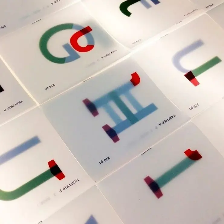
Vellum prints belong to a different creative logic than standard flat cards. The 135g substrate — semi-translucent, smooth, with no coating — is the whole point. Ink does not soak in; it sits on the surface, and the sheet reads through from behind. That means anything placed underneath a vellum print becomes part of the composition: a backing photocard, a packaging insert, a second printed layer.
Three fixed rectangular formats cover the main use cases: 66×184mm for bookmark-style portrait, 112×112mm for square, and 175×118mm for A6-adjacent landscape. There is no die-cut option and no hardware — this is a flat sheet product. Creators who need shaped overlays must work within these rectangles, which means the composition itself has to do the visual work that a contour cut would otherwise handle.
The Chinese subtitle for this product describes the target as — hazy, dreamlike INS style. That framing is accurate and useful: it tells you the aesthetic register this substrate is built for.
Setting Up the Artwork
Choose your size variant first, then build the canvas to the finished dimensions plus 2mm bleed on all sides. For the square variant that means a 116×116mm working canvas; for the bookmark, 70×188mm; for the landscape, 179×122mm. Work in CMYK throughout — screen RGB values will shift noticeably on the warm vellum ground, and catching that shift before print saves a full production cycle.
Open the product in Popecho's onsite editor and the trim boundary and bleed area load automatically for the variant you have selected. Use those live guides to confirm your composition sits correctly before export. The editor is the fastest way to verify that your design clears the safe zone — keep all critical text and key elements at least 3mm inside the finished cut line, because vellum trim tolerance is unforgiving on thin borders.
Export at 300 DPI minimum in PNG, JPG, or PDF. (PDF is the safest choice for designs with fine linework, since it avoids the compression artifacts that can appear in high-contrast JPEG exports.)
Background handling is the step most creators miss: the vellum is semi-translucent, so a solid white fill does not produce an opaque white field — it prints as a reduced-opacity wash that allows the substrate undertone and whatever is behind the sheet to show through. If your design requires a true white area, that area should simply be left empty so the unprinted vellum reads as the lightest value.
Surface and Production Decisions
Popecho produces these sheets with 4-color high-definition CMYK print. Because vellum is non-absorbent, ink sits on the surface rather than being absorbed into the paper fibre. The practical consequence: highly saturated fills and rich blacks will print at slightly lower perceived density than the same values on coated card stock. The hazy quality is inherent and intentional — it is not a defect to correct in proofing.
Heavy ink coverage over large areas carries a real risk: ink pooling and uneven drying on a non-absorbent surface. Designs with large solid fills — especially dark backgrounds covering most of the sheet — are the most likely to show this. Soft gradients, watercolour-wash textures, light linework, and pastel palettes are the surface's natural language. Dense vector fills and heavy body text blocks will appear muddy against the translucent ground and risk adhesion issues.
Colour output will shift from screen preview because the vellum base carries a warm/cream undertone that affects perceived hue across the whole design. Build and proof in CMYK, not RGB, and if possible run a single-design test order at the 20-piece MOQ before committing to a larger run. Popecho's production lead time is approximately 11 days, so build that into your project timeline. For runs of 500 or more, Popecho's bulk channel handles volume pricing separately.
Finished prints should be handled with care: ink adhesion on vellum is lower than on coated stock, and the surface is sensitive to friction and moisture.
What Trips Creators Up
Designing on a white canvas and expecting white output. The vellum is not white — it is warm and translucent. A white background fill will not produce an opaque white field. Leave background areas empty and let the substrate be the lightest value in the composition.
Heavy solid fills that pool during drying. Large dark fills covering most of the sheet surface are the most common cause of uneven ink drying on vellum. Break up coverage with gradients or texture, and keep solid areas small.
Colour built in RGB. Vellum's warm undertone shifts perceived hue, and RGB-to-CMYK conversion compounds that shift unpredictably. Build in CMYK from the first canvas and check values before submitting.
Forgetting the layering use case during layout. Vellum prints are most effective placed over a backing card or insert — the design and the layer beneath read simultaneously. If you have not considered what will sit behind the sheet in your final presentation, the design may not land the way you intended.