
Kraft Poster File Setup: Designing for Amber Paper
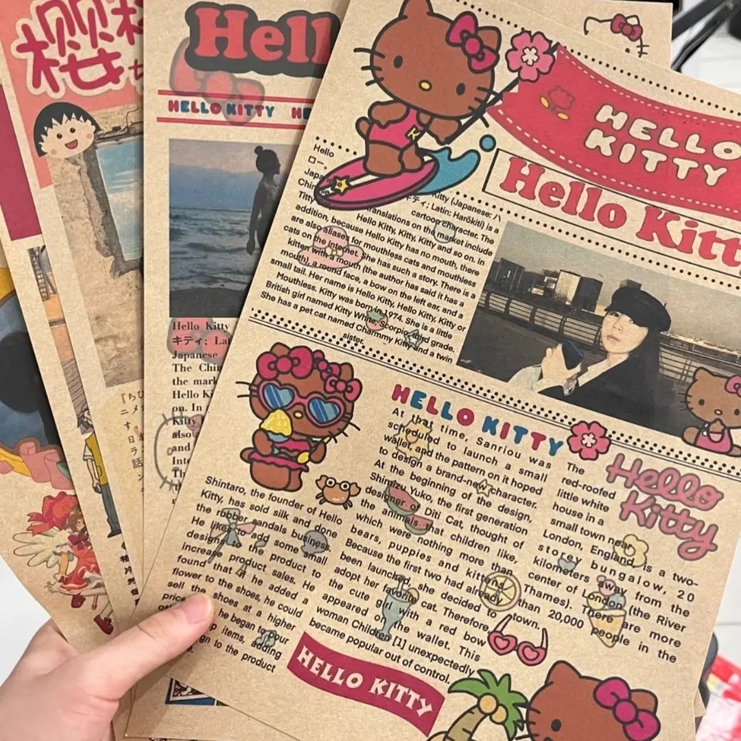
Kraft Poster File Setup: Designing for Amber Paper
Why the uncoated kraft tone rewrites every colour and white decision in your file.
TL;DR
Popecho's kraft paper poster prints your artwork on 300g unlaminated yellow kraft stock at 210×285mm, with a wanted-poster template frame as the starting canvas rather than a blank page. The single decision that shapes everything else is accepting that the amber paper IS your background — whites disappear into it, colours skew warmer, and the vintage texture is a feature. Set your file to 216×291mm at 300 DPI in RGB, drop your art into the template inside Popecho's editor, and proof on a warm-toned preview before ordering your first 4-piece run.
What This Subtype Actually Demands
A kraft paper poster is not a standard poster with a different stock. The 300g yellow kraft substrate is unlaminated and uncoated, which means the paper itself is a permanent, active layer in your design — not a neutral carrier. Every colour you place on it will be filtered through an amber lens, every pale tone will merge with the paper grain, and every white area will simply not exist as a printed element.
On top of that, this is a wanted-poster novelty format. Popecho supplies a pre-designed template frame — Dead or Alive, Superstar, Reward, Galactic Gifted, and others — into which you drop your character art or idol photo. This is not a blank-canvas product. The template structure sets the compositional hierarchy, so your main job is matching your subject artwork to that frame rather than building a layout from scratch.
Those two facts together — amber substrate, template-first composition — define every setup decision below.
Setting Up the Artwork
Open the product in Popecho's onsite editor and the wanted-poster template loads immediately as your starting canvas. There is one template configuration available for this product, so the variant is already selected. The editor's front-surface workspace shows you the full 216×291mm canvas, including the 3mm bleed boundary, without requiring you to build the file from zero.
Your design file must be 216×291mm — that is the working canvas including bleed. The finished cut is 210×285mm; Popecho trims the outer 3mm on all four sides after production. Keep every piece of critical text and every face crop at least 3mm inside the finished cut line, which puts it 6mm from the canvas edge. Elements placed closer than that risk being shaved by the trim.
Colour mode must be RGB. CMYK files will cause a colour shift and oversaturation on output — convert before uploading, not after. Resolution is 300 DPI minimum. Upload PNG or JPG, recommended at or below 4 MB.
Background handling is where most creators get tripped up early: extend your artwork all the way to the canvas edge — no white fills, no solid-colour padding in the bleed zone. White in that area will be physically exposed after trimming and reads as a file error, not a production variance.
Surface and Production Decisions
The 300g kraft stock absorbs ink differently from coated paper. Light tones and pale mid-tones are pulled into the amber base, so pastel backgrounds, light grey text, and any off-white detail in your character art will read muddier and warmer in print than on screen. The practical fix is to design with contrast: strong dark outlines, saturated mid-tones, and a willingness to let the paper colour do the work in highlight areas rather than fighting it with pale fills.
Because there is no lamination, the surface has a slightly rough hand-feel and a matte appearance. This is intentional — it is the source of the vintage, retro aesthetic that makes the wanted-poster format feel tactile rather than mass-printed. When marketing this product to your buyers, the texture is a selling point, not a limitation.
Printed colours will appear warmer and somewhat more muted than your uploaded file. This is a normal and expected material characteristic of kraft printing, not a production defect. Popecho's production lead time for this product is 11 days, so build that into your project calendar before launch week.
For orders of 500 or more pieces, Popecho offers direct bulk custom pricing — contact Popecho through the product page for a dedicated quote on larger runs.
What Trips Creators Up
Designing white as a colour. On kraft paper, white ink is not used — white areas in your file expose the paper tone. If your character's costume, background, or text uses white as a positive design element, rethink those areas in warm cream, light gold, or simply let the kraft show deliberately.
Uploading a CMYK file. The colour shift from a CMYK upload is significant enough to change how your artwork reads on the finished poster. Convert to RGB before you upload; the preview inside Popecho's editor will more accurately represent the final output once you are working in the correct colour space.
Extending a white background into the bleed zone. Any white padding placed at the canvas edge will be visible as a white strip on the trimmed poster. The bleed must be filled with artwork — extend your design elements to the canvas boundary, or accept the kraft tone as the edge.
Expecting screen-accurate saturation. The amber substrate shifts every colour toward warm and muted. Proof your design mentally against a warm-toned preview rather than a bright white monitor background before committing to a print run.