Leather Coaster File Setup: Surface, Bleed, and Color
Leather Coaster File Setup: Surface, Bleed, and Color
How plain vs. grid texture and RGB discipline change what your UV print actually looks like.
TL;DR
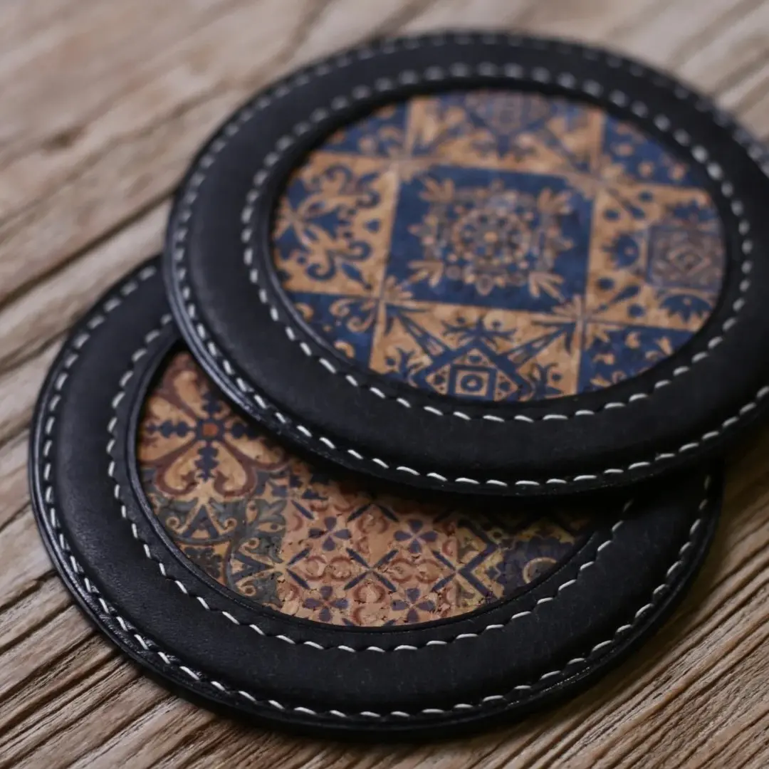
A Popecho custom leather coaster is a 100×100mm UV-printed PU leather piece, 2.8mm thick, available in round or square and in plain or grid-texture finishes. The single most consequential decision is surface choice — plain grain lets fine detail through cleanly, while grid texture breaks up small linework. Start by opening the product in Popecho's onsite editor, which loads the 106×106mm canvas with the die-cut outline and 3mm bleed boundary already in place, then extend your artwork fully to the red frame edge before exporting as a 300 DPI RGB file.
What This Subtype Actually Demands
A leather coaster lives on a desk or table every day. That changes what good artwork means here. Unlike a badge or a sticker that someone handles once and pins or sticks, this piece gets picked up, set down, and seen by anyone in the room — so background fill quality, edge cleanliness, and color consistency under different lighting all matter more than they would for a purely collectible format.
The 100×100mm bounding dimension applies to both the round die-cut and the square variant, which means your file setup is identical regardless of shape — the difference is only what gets cut away. The UV print process covers the full face in continuous color, so whatever you place in the bleed zone will be printed, then trimmed. The leather substrate adds a layer of decision-making that paper and acrylic don't: the surface you choose sits beneath the ink, not just behind it.
Setting Up the Artwork
Both the round and square variants use the same 106×106mm upload canvas. The finished cut is 100×100mm; the extra 6mm total (3mm per side) is the bleed. Work at 300 DPI, export as PNG or JPG, and stay under the 3MB file size limit.
Popecho's onsite editor loads the die-cut outline and bleed boundary for each variant at the correct canvas dimensions — open the product in the editor and the red frame marking the 106×106mm bleed edge is already visible. Two template starting points are available in the template catalog, which is a useful baseline if you want to see how the crop falls before committing your own artwork. The safe-zone guide inside the editor marks where the 3mm boundary sits; keep all text and focal elements inside it.
One specific setup habit that matters here: extend your actual background artwork all the way to the red frame edge. Do not fill the bleed zone with a solid color block that differs from your design — if the cut drifts even slightly, that padding color becomes a visible border. Push your real artwork out to the edge and let the trim decide where it lands.
Surface and Production Decisions
The two leather surfaces behave differently under UV ink in ways that affect design choices before you finalize anything.
**Plain PU leather ** has a smooth matte surface. UV ink sits evenly across it, so fine linework, gradients, and small text all reproduce cleanly. This is the lower-risk surface for detail-heavy illustration work. Minor micro-surface blemishes are inherent to the leather material and are not quality defects — they appear occasionally regardless of artwork.
**Grid-texture PU leather ** has an embossed pattern beneath the print layer. Ink that lands in the texture valleys can appear slightly interrupted, which makes very fine lines and small-point text look broken under close inspection. Bold graphic designs, solid fills, and high-contrast shapes read well on this surface; intricate linework does not. If your design has fine detail you want fully legible, choose plain.
On color: UV printing is a wide-gamut process, but it is not unlimited. Colors that read as neon or fluorescent on screen — or that register below roughly 20% saturation value in Photoshop's eyedropper — fall outside the reproducible range and are not covered by the after-sales quality guarantee. If your design palette pushes into those zones, order a single-unit proof (MOQ is 1) before scaling up. Extreme palettes justify a physical proof every time.
What Trips Creators Up
Wrong canvas size. Uploading a file that is not exactly 106×106mm — whether too large or too small — causes the image to be rescaled, which introduces blurriness in the final print. The editor shows you the target canvas; match it precisely before exporting.
CMYK file submission. This is the most common color disaster in UV leather printing. A CMYK file fed into an RGB pipeline produces heavily saturated, shifted output. Convert to RGB in your design application before export — not after. If the cart preview looks different from your screen file after upload, a CMYK source file is the first thing to check.
Symmetrical layouts that expose die-cut drift. A slight shift in the circular die-cut is within normal production tolerance. A perfectly centered, radially symmetrical design will make that drift obvious. Offset compositions, non-centered focal elements, and deliberate asymmetry are more forgiving when the cut lands a fraction of a millimeter off-center.
Fine text on grid-texture surface. Small labels, signature lines, or dense detail that would read clearly on plain leather often disappear into the embossed grid valleys. Test fine text at your actual print scale in the editor preview and switch to plain surface if legibility matters.