
CMYK vs RGB for Merch Printing: Why Your Colors Shift
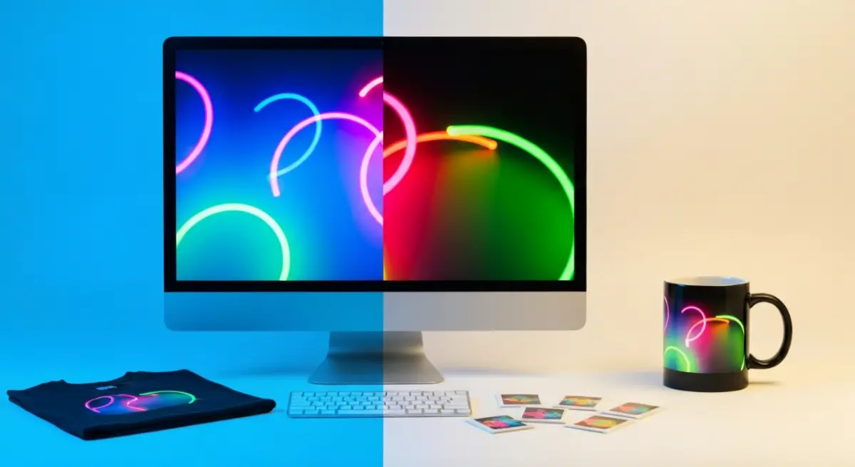
CMYK and RGB are the two color models behind every merch product. RGB builds color with light on a screen. CMYK builds it with ink on paper. Color deviation is the visible gap between the two, and it is the reason so many creators open their first print run to find the orange gone muddy, the sky blue turned grey, and the neon pink faded to a dusty rose.
That gap comes from how the file was prepared rather than from the press, and it is decided long before the job runs.
Table of Contents
- The screen-to-print color gap
- What is RGB, and why do screens show colors ink can't?
- What is CMYK, and what can't it reproduce?
- Where does color deviation happen in production?
- How to prepare files that survive the press
- Color deviation by product type
- Who does color deviation affect most?
- FAQs
The screen-to-print color gap {#the-assumption-that-costs-creators-money}
It's natural to expect that what you see on screen is what you get in print. In practice the two rarely match exactly.
Your screen emits light. Your printed product reflects it. Those are two different physical processes, and they produce two different color ranges, called color gamuts. Color deviation lives in the gap between them.
CMYK and RGB aren't the problem, and neither is converting between them. The trouble starts when a file gets converted with no deliberate control. Send an RGB file to a CMYK press, let the printer's software sort it out, and that automatic conversion is almost never tuned to your design intent. The press has no way of knowing your character's signature violet is non-negotiable. It maps the color to the nearest in-gamut match and moves on.
What is RGB, and why do screens show colors ink can't? {#what-is-rgb}
RGB stands for Red, Green, Blue. It is an additive color model, which means colors are built by adding light. All three channels at maximum give you white. All three at zero give you black.
Every screen you work on renders color in RGB. Procreate, Clip Studio Paint, and Photoshop all default to RGB color mode. The RGB gamut is wide. It can show colors that simply cannot exist in ink: electric blues, vivid magentas, and saturated cyans that almost glow.
That is why your artwork looks so alive on screen. The screen generates those colors with light, and no ink on paper can match it.
What is CMYK, and what can't it reproduce? {#what-is-cmyk}
CMYK stands for Cyan, Magenta, Yellow, and Key (black). It is a subtractive color model, which means colors are created by absorbing light. The more ink you add, the darker the result.
Commercial printing presses, whether offset, digital, or UV, all operate in CMYK. When your file goes to press, it is rendered through these four ink channels. The CMYK gamut is significantly narrower than RGB, so certain colors fall outside what ink can reproduce at all.
Not every color is affected the same way. Midtones and earth tones usually survive conversion well. Saturated neons, electric blues, and vivid purples do not. They compress, sometimes dramatically, into duller and flatter versions of themselves.
Where does color deviation happen in production? {#where-deviation-happens}
The conversion problem
When an RGB file enters a CMYK workflow with no deliberate conversion, the printer's RIP software (Raster Image Processor) runs an automatic conversion using a default ICC profile. That profile is not calibrated to your artwork. It is calibrated to the press's average output.
The result favors technical correctness over visual fidelity. Your neon orange becomes a standard orange. Your vivid violet drifts toward grey-purple.
The fix is a controlled conversion, not an uncontrolled one. Submit your files in RGB and PopEcho converts them with a profile calibrated to the product and substrate, which keeps that mapping under control for you. If you would rather steer how out-of-gamut colors are handled yourself, convert to CMYK in your design software with a target ICC profile before you submit. Either way, the goal is a conversion tuned to your design rather than left to a generic default.
Substrate absorption and color shift
Even a perfectly converted CMYK file can shift on press, because ink behaves differently depending on what it lands on.
A coated substrate such as glossy paper, acrylic, or PVC reflects more light, so colors look more saturated and contrast reads higher. An uncoated substrate such as matte paper, fabric, or natural wood absorbs more ink, so colors look softer, slightly darker, and less saturated.
This is why a badge and a poster printed from the same file can look noticeably different. The file is identical; only the substrate changed.
The neon problem
Neon and fluorescent colors sit entirely outside the CMYK gamut. No combination of CMYK inks produces a true neon pink, neon green, or neon yellow.
Some printing processes solve this with spot colors, a fifth or sixth ink channel loaded with a pre-mixed fluorescent ink. This is common in offset printing for high-volume runs. For short-run digital printing, the press just maps those colors to the nearest in-gamut match.
If your design leans on neon for its visual identity, such as fan art with vivid character palettes or Artist Alley prints built on high-energy color, you need to plan for spot color production or rework those values with the CMYK gamut in mind from the start, not after the samples arrive.
How to prepare files that survive the press {#file-prep}
Submit in RGB, or convert deliberately. PopEcho's workflow accepts RGB and converts it with calibrated profiles, so for most creators submitting RGB is the reliable default. If you want direct control over the mapping, convert to CMYK yourself in Photoshop or Illustrator (Edit > Convert to Profile) using a target space like ISO Coated v2 (ECI) or US Web Coated (SWOP) v2. The one thing to avoid is handing an RGB file to an uncontrolled automatic conversion that is not tuned to your design.
Use perceptual rendering intent for illustrated or photographic work. Perceptual rendering compresses the whole color range proportionally to fit inside the CMYK gamut. It keeps the relationships between colors intact even when absolute values shift. For flat graphic work with solid fills, relative colorimetric rendering is often more accurate.
Check your blacks. In RGB, black is 0/0/0. In CMYK, a rich black for print is typically 60C/40M/40Y/100K, though this varies by press and substrate. A flat 0/0/0/100K black across a large area often looks washed out on press. Too much total ink coverage causes bleed and slow drying. Know your printer's maximum ink density before you submit.
Build in bleed lines. 3mm of bleed on all sides is standard for most merch products. Artwork that runs to the edge, such as backgrounds, borders, and full-bleed illustrations, needs to extend past the trim line. Artwork that stops exactly at the design edge will show a white border after cutting.
Soft-proof before you finalize. Most professional design software supports soft proofing, a screen simulation of how your file will look when printed to a specific profile. It is not perfect, but it surfaces the worst color deviations before you commit to a full print run.
Color deviation by product type {#deviation-by-product}
Different products carry different deviation risks. This is not about quality. It is about substrate behavior and printing method.
- Posters and postcards. Printed on coated paper stock. CMYK deviation is predictable and manageable with proper file prep. Glossy lamination raises perceived saturation slightly.
- Acrylic standees and keychains. UV printing onto acrylic. Colors tend to read slightly more saturated than on paper because the substrate is reflective. Whites need a white ink base layer; without it, the acrylic's transparency affects how color renders.
- Badges and pins. Offset or digital printing onto coated metal or plastic. Small format amplifies any color deviation. A 2% shift is invisible on a large poster, but on a 58mm badge it reads clearly.
- Stickers. Die cut and half-cut stickers printed on vinyl or BOPP. The substrate is coated and takes ink well. Matte lamination softens colors, gloss lamination intensifies them. The choice depends on your design's tonal range.
- Holographic badges. The holographic substrate adds a base pattern that interacts with printed color. Solid dark fills perform well. Light, pastel, or transparent areas let the holographic effect show through the ink, which is often intentional but has to be planned for.
Who does color deviation affect most? {#who-it-affects}
Color deviation is not spread evenly across creator types. Some workflows are far more exposed than others.
- Fan artists and illustrators. Designs built in Procreate or Clip Studio Paint are always in RGB. When that RGB goes through an uncontrolled conversion instead of a calibrated one, the results surprise people, which is why this group sees the highest rate of color disappointment on first print runs. Submitting to a calibrated RGB workflow and proofing before you approve is what prevents it.
- Character IP holders. Brand colors tied to a specific character's palette are non-negotiable. A 10% shift in a signature color reads as wrong to the audience. These creators should document their signature colors as hex or Pantone references and proof them before production begins.
- Artist Alley sellers. High-volume, fast-turnaround production leaves less time to proof. Color deviation compounds across a full table of products when the source files are inconsistent.
- Small brands and independent labels. Packaging, promotional prints, and merchandise all need to match each other. Color consistency across substrates takes a calibrated workflow, not just one good file.
- Event organizers. Batch production of badges, standees, and prints for a single event. Deviation in one product category creates visible inconsistency across the whole set.
PopEcho's production workflow accepts RGB file submissions and handles the conversion with calibrated output settings meant to minimize deviation across its product catalog. For creators who want direct control over the conversion, pre-converted CMYK files are also accepted. Both paths are available at popecho.art.
FAQs {#faqs}
What is the main difference between CMYK and RGB for printing?
RGB is an additive color model used by screens, so it produces color with light. CMYK is a subtractive model used by printing presses, so it produces color with ink. The RGB gamut is wider, which means it can represent colors that CMYK ink cannot physically reproduce. When an RGB file prints without deliberate conversion, those out-of-gamut colors compress into duller equivalents.
Why do my colors look different after printing?
The most common cause is an uncontrolled RGB-to-CMYK conversion. Submit an RGB file to a CMYK press and the printer's software converts it automatically with a default profile, one that is not calibrated to your design intent. The second most common cause is substrate behavior. The same file prints differently on coated versus uncoated surfaces because ink absorption changes how colors read.
Should I convert my file to CMYK before submitting?
Not necessarily. PopEcho accepts RGB and converts it with calibrated profiles, so submitting RGB is the reliable default for most creators. Convert to CMYK yourself only if you want direct control over how out-of-gamut colors are handled, using a target ICC profile in Photoshop or Illustrator. What causes color surprises is not CMYK or conversion itself, but handing an RGB file to an uncontrolled automatic conversion that is not tuned to your design.
What colors are most at risk of deviation in CMYK printing?
Neon and fluorescent colors fall entirely outside the CMYK gamut and will always compress significantly. Saturated electric blues, vivid purples, and bright magentas are also high-risk. Midtones, earth tones, and most skin tones convert with minimal visible deviation.
What is a bleed line and why does it matter for merch?
A bleed line marks the area beyond the trim edge of a product. Artwork that extends to the edge of a design, such as backgrounds, borders, and full-bleed illustrations, must extend into the bleed zone (typically 3mm) to prevent white borders appearing after cutting. If your artwork stops exactly at the design edge, any minor cutting variation will expose the substrate underneath.
What is an ICC profile and do I need one?
An ICC profile is a standardized file that describes the color behavior of a specific device or printing process. If you choose to convert your file to CMYK yourself, using a target ICC profile tells your design software to simulate how that specific press will render your colors. Most commercial printers supply their ICC profile on request. Common defaults include ISO Coated v2 for European offset printing and US Web Coated (SWOP) v2 for North American digital presses.
Does the lamination finish affect color output?
Yes. Gloss lamination raises perceived saturation and contrast, so colors read slightly more vivid. Matte lamination softens the surface and reduces contrast, so colors read slightly flatter and more subdued. For color accuracy alone the difference is minor; the choice depends on whether your design benefits from higher contrast and vibrancy or from a more restrained, tactile finish. Plan your color values with the intended finish in mind, not after the fact.