
Artist Alley Posters: Paper Weight, Finish, and File Prep
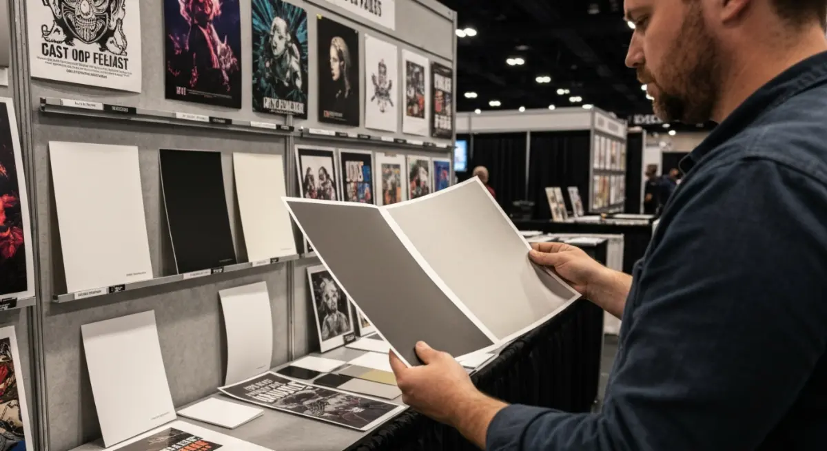
For an Artist Alley table, a poster's sales performance rests on three production decisions more than on the image itself: paper weight, finish, and file preparation. Posters get treated as the easy product. Print the art, sleeve it, price it at $15, and move on. Next to acrylic standees or holographic badges, the production choice feels almost trivial. Treating it that way costs money.
Paper weight, finish, and file prep decide how your poster reads from three feet away, how it holds up across a six-hour convention floor, and whether a buyer reaches for it or keeps walking. They are production decisions with measurable outcomes, not surface preferences.
Table of Contents
- Why posters aren't the easy product
- What does paper weight (gsm) tell you?
- Which finish suits your art?
- Why do your colors shift from screen to print?
- What size fits your table?
- Bleed lines and safe zones: what gets cut?
- Who this applies to
- FAQs
Why posters aren't the easy product {#poster-decisions}
The image is the part most artists spend their time on. The production choices around it are the part that decides whether the print holds a flat display, survives a weekend of handling, and reads as something worth paying for. Get those wrong and a strong illustration still ends up in the discount bin by Sunday afternoon.
The rest of this guide walks through each decision in the order you make them: paper weight first, then finish, then color, then size and file prep.
What does paper weight (gsm) tell you? {#paper-weight}
Paper weight, measured in grams per square meter (gsm), describes how dense and rigid the sheet is. It doesn't tell the whole story on its own, but it is the first number you need to understand.
A 90gsm sheet is close to standard office paper. It flexes under its own weight, picks up handling marks fast, and won't hold a flat display position without backing. For a product you are asking someone to pay for, that hand-feel signals low quality before the buyer even registers the image.
The 170gsm threshold
170gsm is the practical floor for Artist Alley posters. Below it, the sheet bends visibly inside a sleeve display, and the print surface lacks the density to hold saturated colors without looking washed out under convention lighting.
200 to 250gsm is where most experienced AA artists land. The poster holds its shape, survives repeated handling across a table, and carries enough weight to feel intentional rather than disposable.
300gsm and above moves into card stock territory. At that weight a poster reads more like a collectible print. The hand-feel shifts noticeably, and buyers register it as higher value before they see the price.
When is heavier not better?
Heavier stock costs more per unit and ships heavier. If you are printing 50 copies each of 10 designs to test at your first convention, 200gsm is a more practical decision than 300gsm. The quality difference between the two is real, but it is smaller than the cost difference at volume.
For beginners, the sensible path is to start at 200gsm, watch sell-through, and move your confirmed best-sellers up to 300gsm.
Which finish suits your art? {#finish-types}
Finish is a production variable, not decoration. It changes how color reads, how the poster interacts with light, and how the surface holds up under repeated handling.
Matte finish
Matte absorbs light rather than reflecting it, so colors look softer and slightly less saturated than they do on screen. The surface resists fingerprints and glare, which matters on a convention floor running overhead fluorescents.
Matte's strongest advantage is legibility. Detailed linework, fine gradients, and text-heavy designs read more cleanly on a matte surface. If your art is built on intricate detail, matte is the more reliable choice. The limitation: matte can flatten highly saturated colors, such as vivid magentas and electric blues, more than you intended. If color vibrancy is central to your IP, test a matte proof before committing to a full run.
Gloss finish
Gloss reflects light and amplifies saturation. Reds read redder, blacks read deeper, and the surface has a physical presence matte doesn't. The problem is glare. Under direct convention lighting, a gloss poster in a sleeve display produces hotspots that can obscure the image from certain angles, so a buyer standing slightly off-center may not read the artwork clearly.
Gloss works well for photography-based prints, character art with bold flat colors, and designs where color impact is the main draw. It works less well for detailed illustration with fine linework, where the reflective surface competes with the image instead of serving it.
Satin and soft-touch
Satin sits between matte and gloss: moderate sheen, reduced glare, reasonable color vibrancy. It is a practical middle ground for artists who want some color pop without the full reflectivity of gloss.
Soft-touch laminate is a finish applied over the print surface. It creates a velvety, low-friction hand-feel that reads as premium the moment someone picks it up. The first impression of a soft-touch poster is physical before it is visual. It adds cost, and it earns that cost on limited-edition prints, artist-signed pieces, or anything positioned above your standard table price.
Matte and gloss aren't ranked against each other. Match the finish to your specific art style and display context.
Why do your colors shift from screen to print? {#rgb-cmyk}
This is one of the most common questions from creators preparing a first poster run. Your screen displays color in RGB, the red, green, and blue light a monitor emits. Printing presses work in CMYK, the cyan, magenta, yellow, and black ink laid on paper. The two systems don't map onto each other perfectly, so some colors that exist in RGB have no exact CMYK equivalent.
The visible result is color deviation: the file looks one way on screen and prints a little differently on paper. The colors that shift most are neon tones, electric blues, vivid purples, and bright oranges, which sit easily in RGB and compress in CMYK, sometimes significantly.
The fix is a controlled conversion rather than an uncontrolled one. PopEcho accepts RGB files and converts them with a profile calibrated to the product and substrate, which keeps that mapping under control for most creators. If you would rather steer how out-of-gamut colors are handled, convert to CMYK yourself in your design software using a target ICC profile before you submit, then proof the result against your original. The one thing to avoid is handing an RGB file to a generic automatic conversion that isn't tuned to your design.
What size fits your table? {#size-decisions}
Standard Artist Alley poster sizes cluster around A3 (297 × 420mm), A2 (420 × 594mm), and 11×17 inches. These formats fit standard sleeve displays and are what buyers expect to find at a table.
The size decision is about your table layout as much as the art. A table dominated by A2 posters in vertical displays reads as a gallery wall and signals investment and seriousness. A table of A3 prints in a flat stack signals affordability and accessibility. Both are valid positioning strategies, and they produce different buyer behavior.
If you are selling at your first convention, A3 at 200gsm matte is a lower-risk entry point: lower unit cost, easier transport, easier display. Once you know which designs sell, produce A2 versions of those specific pieces at a higher paper weight.
Avoid printing everything at the largest size. Dead inventory in a large format is heavier and harder to store than the same unsold count in a smaller one.
Bleed lines and safe zones: what gets cut? {#bleed-safe-zones}
Every print file needs a bleed, an extension of your artwork beyond the intended trim edge, typically 3mm on each side. Without it, any slight misalignment during cutting produces a white border where you didn't want one.
The safe zone is the inverse: the area inside the trim edge where critical content such as faces, text, and key design elements must stay. That zone usually sits 3 to 5mm inside the trim line.
Most artists who have printed before know this. The mistake they still make is placing important detail too close to the trim edge and relying on the bleed to catch it. That is not what bleed is for: bleed handles the substrate edge, while the safe zone keeps your content clear of the trim.
Set up your file with both and check them before export. A poster with a cropped face or clipped text is a file preparation error, not a production error.
Who this applies to {#who-its-for}
- Independent artists at conventions, choosing paper weight and finish for table display posters where perceived quality drives the purchase at a glance.
- Fan artists and character IP creators, managing color deviation for highly saturated character art that reads differently in print than on screen.
- Artists scaling from digital to physical, making their first production decisions about substrate, finish, and file prep without prior print experience.
- Small-batch merch producers, balancing unit cost against perceived quality across multiple designs with uncertain sell-through.
- Artists building a tiered product table, using format, paper weight, and finish to signal price positioning without a label.
FAQs {#faqs}
What paper weight should I use for Artist Alley posters?
200gsm is the practical standard for most convention posters. It holds its shape in a sleeve display, handles repeated contact without showing damage, and carries enough perceived quality for standard table pricing. Move to 300gsm for limited-edition or premium-positioned prints.
Should I use a matte or gloss finish for my art prints?
Both work; it depends on the art. Matte reduces glare and suits detailed linework and fine illustration. Gloss amplifies color saturation and suits bold, flat character art. The right finish depends on your art style and the lighting where you display.
Why do my printed colors look different from my screen?
Your screen uses RGB light and the press uses CMYK ink, and the two don't map perfectly. Colors like vivid purples, electric blues, and bright oranges deviate most. PopEcho accepts RGB files and converts them with a calibrated profile, which keeps the shift under control for most creators. If you want to steer the conversion yourself, convert to CMYK with a target ICC profile and proof it against your original before submitting.
What is a bleed and why does my file need one?
A bleed is a 3mm extension of your artwork past the intended trim edge. It keeps minor cutting misalignment from producing an unwanted white border. Without bleed, even a small shift during cutting exposes the unprinted substrate at the edge.
What poster sizes work best for Artist Alley tables?
A3 (297 × 420mm) and A2 (420 × 594mm) are the most common formats. A3 is a lower-cost entry point suited to testing new designs. A2 creates a stronger visual presence in a vertical sleeve display. Many experienced artists run both, keeping A2 for confirmed best-sellers.
Can I submit RGB files for poster printing?
Yes. PopEcho accepts RGB print files and handles the conversion with calibrated profiles to reduce color deviation. If you prepare files yourself in professional software, converting to CMYK with a target profile before submission gives you more direct control over the final result.
How many poster designs should I bring to my first convention?
Fewer designs at higher print quality tend to outperform many designs at lower quality. A focused table of 6 to 8 designs at 200gsm with the right finish reads as more considered than 20 designs printed at 90gsm on uncoated stock.
Paper weight, finish, and file prep are part of how a poster earns its place on the table, not an afterthought to the artwork. A well-prepared file on the right paper, displayed well, sells. The same image on the wrong stock, with color deviation and no bleed, has to work much harder.
At PopEcho, decisions like these run through printing specialists who work across the full range of paper weights and finishes, with production available from a single copy so you can test a design before committing to a run. Learn more at popecho.art.