PVC Clear Card File Setup: Designing for Full Transparency
PVC Clear Card File Setup: Designing for Full Transparency
Why every unprinted pixel stays clear — and how to design around that from the start.
TL;DR
PVC clear cards print directly onto rigid transparent plastic, so any area you leave unprinted stays fully see-through — there is no paper-white to fall back on. The most important decision is how you handle your background: intentional opacity versus intentional transparency has to be built into the file before you export. Open the product in Popecho's onsite editor, confirm the canvas and safe zone for your chosen size variant, export at 300 DPI in CMYK, and you're ready to order from a 5-piece MOQ.
What This Subtype Actually Demands
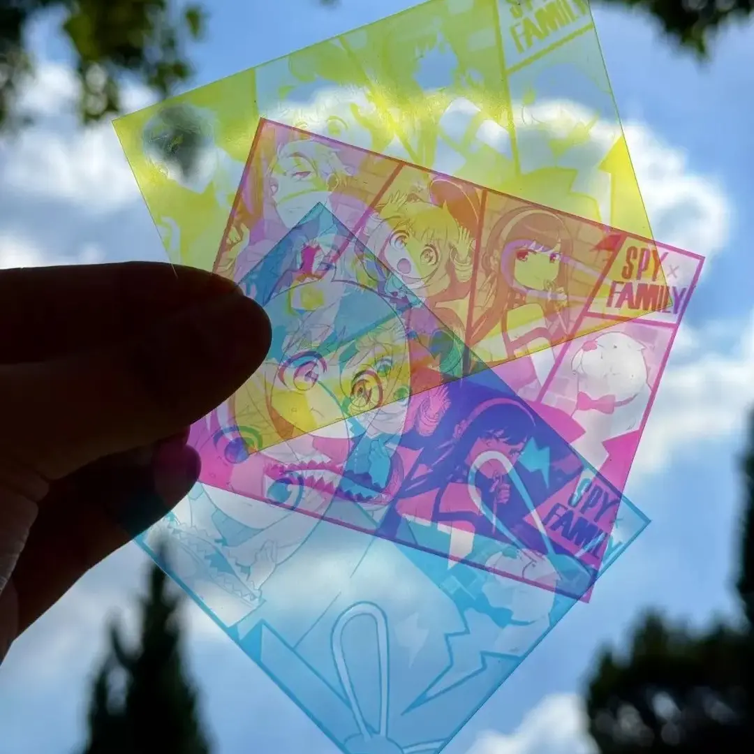
PVC clear cards do something no paper-based format can: they let the background show straight through the card. That single material fact changes every design decision. On an opaque photocard, white space is paper. On a PVC transparent card, white space is air — literally whatever is behind the card when someone holds it up. Foreground isolation is no longer a stylistic choice; it is the structural job of the artwork.
The format also splits naturally by use case. Popecho's small variant sits at roughly photocard dimensions, making it the natural fit for collector-pull sets and blind-bag inserts. The postcard-size variant (approximately 100 × 148 mm) is the display-tier option — larger, more gift-friendly, and more suited to showcase framing than pocket collecting. Knowing which role your card is serving before you open the canvas will shape every composition decision that follows.
Setting Up the Artwork
When you open the product in Popecho's onsite editor, the canvas loads to the exact dimensions of the size variant you select — Small at approximately 54 × 86 mm, Large at approximately 63 × 88 mm, or Postcard at approximately 100 × 148 mm. The safe-zone overlay snaps into place at the same time, marking the 3 mm inner margin where critical text and character faces need to stay to survive the cut. You do not need to build these guides from scratch.
Extend your artwork 2 mm beyond the finished cut edge on all four sides for bleed. Export at 300 DPI minimum, in CMYK color mode. Accepted formats are PNG, JPG, and PSD.
The most consequential background decision: if you want a floating-character look with full transparency behind the subject, remove every non-character pixel and export as PNG with transparency preserved. If you want a solid-colored background, that color will print fully opaque — but light colors and pale gradients can look washed out against the clear substrate unless you add a white underprint layer. Check whether white underprint is available for your specific order before locking artwork, since that single layer is what gives pastel tones any body on clear PVC.
(Confirm your finished-cut size inside the editor rather than estimating from the spec sheet — rounding differences between size variants are small but they affect bleed placement.)
Surface and Production Decisions
Rigid PVC has a glassy surface that looks premium on reveal but shows fingerprints and micro-scratches quickly. For K-pop photocard-style drops or any release where unboxing quality matters, a protective sleeve in the packaging is a practical call, not an optional extra.
Dark or saturated backgrounds behind a character will read very differently on clear PVC than they did in your design file. On paper, a dark background stays contained. On clear PVC, that same dark field creates a sharp visual frame that can feel heavier than intended — especially in a layered or stacked display. If you're going for the floating-character effect with no background at all, make sure every background pixel is removed in the source file; the press does not interpret transparency from a flattened JPG.
Color proofing matters more here than on opaque substrates. Transparent PVC shifts perceived hue, and a color that reads correctly on a paper proof may appear cooler or more saturated on the finished card. For your first PVC clear card run, especially where skin tones or brand colors are critical, a physical proof before the full batch is worth the extra lead time within Popecho's 10-day production window.
(Volume pricing locks at the time of order — 1–49, 50–199, 200–499, and 500+ are separate tiers, and mixed-size orders may not consolidate into a single tier.)
What Trips Creators Up
Relying on paper-white for negative space. The most common first-run mistake. Areas left unprinted stay clear, not white. If your design has white text or white graphic elements, those need to be printed — either as solid white ink or backed by a white flood fill layer.
Exporting a flattened file with a white canvas. A JPG with a white background will print that white background solid. If your intent was transparency, export as PNG with the transparent layer preserved and confirm the file shows a checkerboard — not white — in the background before uploading.
Pale gradients or pastels without underprint. Light colors look vivid on an opaque substrate and washed-out on clear PVC. Build saturation into lighter tones or confirm white underprint availability before the artwork is finalized.
Ignoring the safe zone on the postcard variant. The postcard size is larger, which can make the safe-zone margin feel generous — but text placed close to the edge on any variant is at risk. The safe-zone overlay in Popecho's editor is the reliable check; use it before export, not after.