
Foil Stamping Cards: Separating Your Foil Layer from Base Print
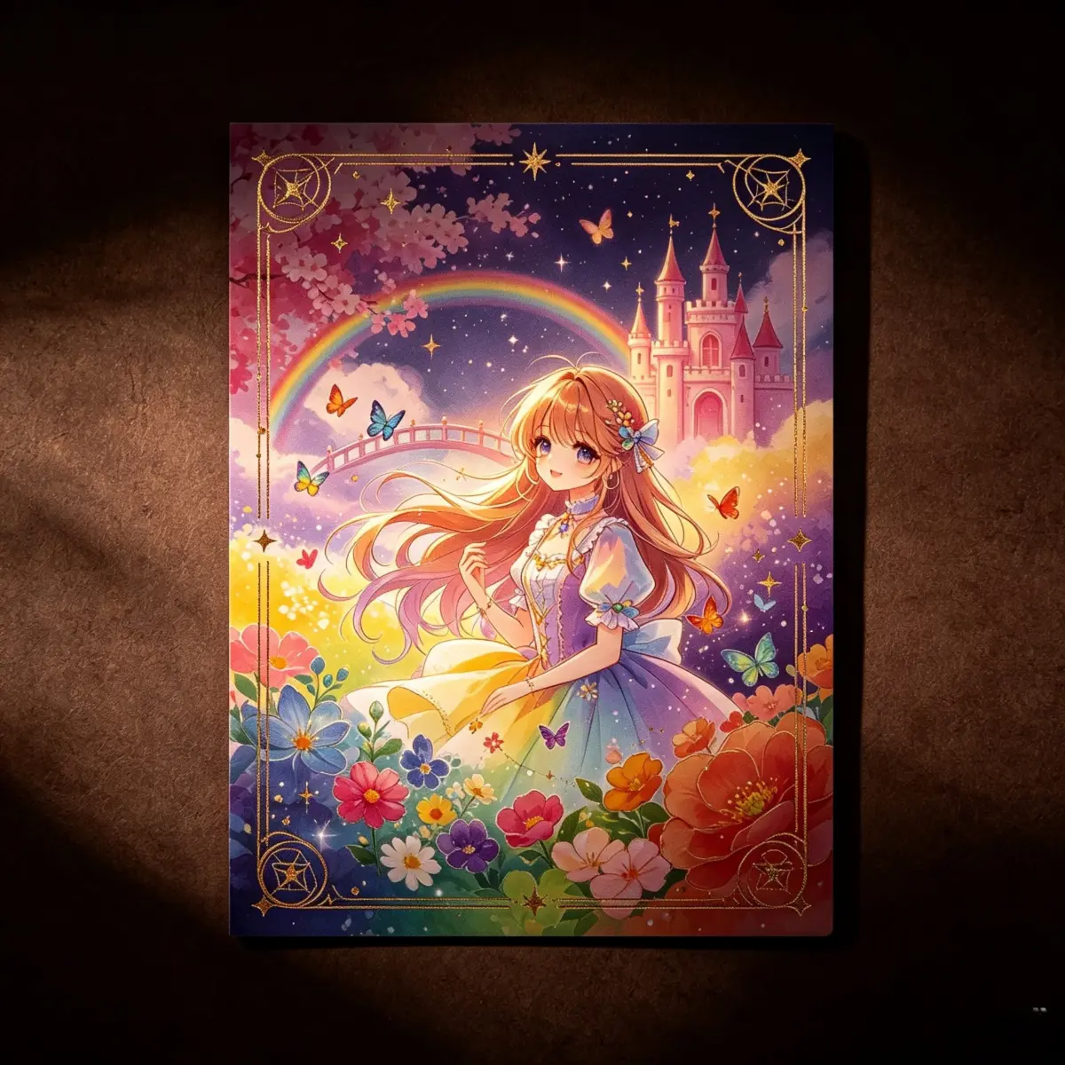
Foil Stamping Cards: Separating Your Foil Layer from Base Print
The two-pass production reality that determines whether your foil lands cleanly.
TL;DR
Popecho's foil stamping card is a 400gsm coated art board collectible — 86×54mm or 87×62mm — printed with a 16-color original-art process and then hot-foil stamped in a second production pass. That two-pass reality is the central design constraint: your file must carry a full-color base layer and a separate, isolated foil mask. Get that separation right, pick your foil variant thoughtfully, and the result is a premium card that reads as collectible-grade the moment someone holds it.
What This Subtype Actually Demands
A foil stamping card is not a standard photocard with a shiny accent added at upload. It is two distinct production events on the same substrate — a 16-color fine-art print pass, then a hot-foil stamp pass — and each pass has its own artwork requirements. The 400gsm coated art board handles both well: its high-gloss surface gives the ink pass vivid tonal depth and gives the foil die a receptive bonding surface. But the thing that trips creators most is treating the foil as a visual effect to describe rather than a physically separate file layer to supply.
Both size options — 86×54mm for a standard photocard format and 87×62mm for a taller tarot-adjacent or TCG-adjacent card — go through the same two-pass process. Rounded corners are standard on both; there is no straight-corner option, so your composition needs to account for the arc at every corner from the start.
Setting Up the Artwork
Open the product in Popecho's onsite editor and select your size variant. The editor loads the die-cut outline, bleed boundary, and safe-zone overlay automatically — these are not files you need to source separately. Work inside those boundaries from the beginning rather than fitting artwork to them afterward.
The editor runs a double-view layout: a front surface and a back surface. The front surface carries the gilding layer, which is where your foil mask lives. The back surface has no gilding layer, so it receives only the base print. Use this split intentionally — front for your foil-highlighted hero art, back for card info, lore text, or secondary illustration that benefits from clean ink without the reflective competition.
For the base print layer: 300 DPI, CMYK color mode, background color extended to the bleed boundary shown in the editor. For the foil mask: supply a single-color (typically solid black) shape layer that isolates exactly the regions you want stamped. Fine linework below roughly 0.5pt will not hold foil cleanly — keep foil shapes bold enough to register reliably at card scale. Submit as PNG, JPG, or layered PSD.
Surface and Production Decisions
The 16-color original-art printing process is not a selectable upgrade — it runs on every order. That means your illustration's gradient range and skin-tone accuracy reproduce faithfully before foil touches the surface. The practical implication: submit CMYK files rather than relying on an RGB-to-CMYK conversion at print time, because the extended color gamut rewards well-prepared files and punishes lazy ones with slight hue shifts in highly saturated areas.
Foil variant choice shapes the collector read of the card significantly. Solid gold and silver read as flat metallic warmth or cool precision — predictable in photographs and in hand. Laser gold and laser silver shift color angle-to-angle; they photograph with unpredictable rainbow shifts, which can work for dramatic unboxing content but can undermine a card where the foil area carries readable text. Polka-dot gold and polka-dot silver apply foil as a halftone dot field rather than a solid fill — a filled shape in your foil mask renders as textured sparkle rather than flat coverage, so test your expectations against the pattern scale before committing. Color foils (blue, pink, purple) behave like solid foils but in hue — they are the strongest choice when your base art palette already leans into a matching color story.
Gilding placement in Popecho's editor is constrained to the front surface. Place foil highlights on elements with enough mass to hold the stamp: character silhouettes, title typography, geometric border frames, icon badges. Avoid placing foil over very fine hair strands or micro-detail linework.
What Trips Creators Up
Mixed layers cause foil misregistration. If your base art and intended foil area live on the same layer, production has no clean way to separate them. Foil stamps where it shouldn't, or not where it should. Keep the foil mask as its own isolated layer before uploading.
Corner-cut arcs eat border frames. Rounded corners remove a real arc at each card corner. A tight decorative border or a QR code with corner-finder squares placed flush with the card edge will be partially clipped. Inset anything structurally important past the corner-cut radius shown in the editor's safe zone.
RGB file submission shifts saturated colors. The 16-color press rewards CMYK source files. An RGB file converted at production time often shifts highly saturated blues or magentas. Convert and proof your file in CMYK before uploading.
Ignoring the 201-unit pricing tier. Per-unit cost drops meaningfully at 201 pieces. Creators planning artist-alley stock or Kickstarter backer rewards who order 190 units to stay under 200 are leaving real margin on the table. Factor the tier threshold into your print-run planning before placing the order.